Brand Distinction for Website That Doesn’t Feel Fake
27 Jul 2020 By: Natalya Bucuy
Updated
“Generally, by the time you are Real, most of your hair has been loved off, and your eyes drop out and you get loose in the joints and very shabby. But these things don’t matter at all, because once you are Real you can’t be ugly, except to people who don’t understand.” (The Velveteen Rabbit by Margery Williams).
I have to be honest, I can never read this quote without tearing up. It’s one of my favorites.
What makes something real?
It’s a difficult question, if one asks for a detailed explanation. But a short answer is easy: it feels real.
When it comes to company branding, authenticity plays an important role. According to one report 90% of consumers say authenticity plays an important role in decision making. (Stackla)
Customers want to feel the authenticity of a brand. It has to look right, smell right, taste right. Which is all great when they can actually see, smell, and taste the company’s products and decide whether or not the way the brand feels is real enough for them.

But a lot of times customers’ interactions do not start in the physical world of sight, scent, and taste. The first time they come in contact with a brand is, as most things are in 2020, online.
Customers come to the brand’s website and the company has all but a few seconds to attract, satisfy, and delight the visitors. It has all but moments to present itself, its unique branding, its culture, its character. It must develop a connection with the visitors’ feelings. And it has to do this through honesty, transparency, and authenticity. Because if it comes across as insincere, then the customers will sense it from the distance of the screen and turn away.
Before we dive into ways to make a website emotionally resonate with the customers and establish authenticity, let’s talk about brand distinction.
Brand Distinction: The Barber’s Pole and the Cabbage Patch Kids.
Here is a familiar picture:

It takes mere seconds to recognize this as the sign for a barber shop. Now, that’s some impressive branding.
After all, the barber’s pole dates back to medieval times! Back then, barbers’ services extended beyond haircuts and included teeth pulling, bloodletting, and other minor medical procedures.
Little historical side note:
The theories behind the red, white, and blue stripes vary. Some state that the white stands for pulled teeth and blue for veins from which patients bled. Others say white is for bandages, red is for blood, and blue is just an American patriotic addition to the original european design. The pole itself represents the staff patients held during bloodletting to make their veins pop. Pretty gruesome, but, hey, what history isn’t?
While bloodletting is no longer a casual procedure barbers offer, the pole remains a recognizable sign. That is an excellent example for brand distinction, however general.
But brand distinction by itself is only half the job. To facilitate brand loyalty beyond mere brand recognition, a company must attach emotional connection to customer experiences.
Ask the 90s kids about which products they remember from their childhood and a list of feels-like-home names can get quite extensive. Cabbage Patch, Dunk-a-roos, My Little Pony, Care Bears, Pogs, Nickelodeon – just the names of these brands alone bring memories and emotions. For many of us, the smell of Play-doh and Crayola crayons remain favorite smells.

The way for brands to reach such a level of emotional resonance with customers is to create true connections. Barber shops through centuries had to do that through face-to-face interactions. The 90s toy and cartoon brands did it through television and school-yard traditions. Today’s brands must do that through their websites.
Here are three website strategies that can help companies build trust, communicate authenticity, and establish brand distinction and identity online.
1. Aesthetics: Attract Humans and Maybe Goldfish.
There is an old marketing myth that humans have an attention span of 6-8 second, which is shorter than that of a goldfish, which can focus for 9 seconds.

While ichthyologists and the psychologists of the world can debate that one out, one thing is clear: human attention span is quite short. Moreover, we make decisions quickly and, often, subconsciously. Not unlike goldfish.
In his book, “Blink,” Malcolm Glaldwell discusses hunches, inner gut feelings, and first impressions. He explains the idea of “thin-slicing – the ability of our unconscious to find patterns in situations and behavior based on very narrow slices of experience.” Our subconscious can then make a decision in as little as two second into any interaction. According to Gladwell, these decisions are crucial and, often, are the most powerful. We’re told from a young age not to judge a book by its cover, but our subconscious mind wants to and does all the time.
“There can be as much value in the blink of an eye as in months of rational analysis.” (Malcolm Gladwell, Blink: The Power of Thinking Without Thinking)
The principle of thin-slicing applies in the virtual world even more because of the amount of digital information consumers encounter online. When visitors come to a website, the brand’s number one task is to make them stay. High bounce rate is something web designers and marketers strive to avoid. After all, if the visitors made it as far as landing on a page but leave quickly because they do not feel attracted to the website, that’s a loss for the company.
So how can we make them stay?
Dr. Deborah Goldring, an associate professor of marketing at Stetson University, says aesthetics are the key.
According to theories in psychology, aesthetics refers to both the organization and clarity of the design as well as the creativity and richness of the experience. When website content is visually presented in a pleasing manner, the site is perceived as highly credible. (Deborah Goldring)
The design of the landing page on which potential customers start their experience with the brand, therefore, is crucial. Color of the layout, Call to Action buttons, use of video, language of the content, and simplicity are among the most important elements of landing page designs.
SIDENOTE: Goldfish see more colors than humans do! Good thing we don’t have to design websites for goldfish, isn’t it?
Beyond the landing page the functionality of the website is also important. Slow loading speeds, misleading content, errors, incompatibility with mobile devices, and overall poor user experience will contribute to high bouncing rate and loss of business.
Authentic brand distinction starts with good user experience. If visitors have to go through a series of error messages and confusing page links, it’s hard to create an emotional resonance and connection with them.
We might not know the exact attention span time for humans or for goldfish. But we know that both would probably get frustrated with poorly designed websites. So step up the aesthetics to please humans and maybe goldfish.
2. Humanity: Thank You Notes Make Magic
It’s impossible to talk about brand authenticity without discussing humanity.
Customers are humans and they crave humanity. They connect to brands that express humanity through their communications and interactions.

Consumers who perceive a brand as human are 2.1 times more likely to love the brand and 1.9 times more likely to be satisfied by it. Similarly, consumers who perceive a brand as human are 1.6 times more likely to purchase from that brand and 1.8 times more likely to recommend it. (Marketing Week)
Through their sites, brands are able to show and communicate human feelings by highlighting emotional drivers that are in tune with the customers. A brand’s true capacity to reflect understanding and care is the key factor in revealing its human nature and winning over the clientele. There is nothing as telling of authenticity as a manner and a voice so that it is clear there are real people, not machines, on the other side of the monitor.
Take a note from the creators of Slack, who provide no shortage of human touch in their messaging.

How can a brand be human online?
According to Braze’s Brand Humanity Study the following factors increase human perception of the brand among customers:
- Natural communication. Canned responses to live chat and emails, impersonal language, or unnecessary formalities harm brand communications with customers.
- Emotion activation in customers. Emotional attributes most important to consumers include: responsive, social, friendly, thoughtful, and helpful.
- Personal and considerate treatment. Customers want to feel like a brand knows them. A company can achieve that by ensuring its messaging is personal and offering recommendations.
When it comes to a website branding, a company can facilitate these expressions of humanity by using a variety of communication techniques.
The techniques include using humor, storytelling, visually stimulating images and layouts, interactive technology, and even showing some blunters. These techniques work because the senses they activate are uniquely and universally human – laughing, listening, seeing, innovating, and making mistakes.
So go ahead, be as human as possible. A thanks you note, a joke, or a friendly live chat message can go a long way. Get creative with tone and voice, and a brand personality will shine through the screens, ensuring brand distinction visitors will not forget.

3. Values: Stand for Something.
“If you don’t stand up for something, you will fall for anything,” (Alexander Hamilton)
One thing that communicates authenticity is the expression of company values. After all, taking a stand for something brings vulnerability to a brand. And nothing is more human than vulnerability.
In 2020 the subject has gone to some extremes with some brands taking political stands.
We have learned- over more than 50 years- that righteous protests like boycotting rely on genuine solidarity and can move powerful forces, either corporate or governmental.
The #GOYABOYCOTT is no different. https://t.co/RG5cblppMo
— United Farm Workers (@UFWupdates) July 19, 2020
Social and political stands matter more than ever according to a recent Harvard Business Review report. The study showed that company values do affect consumer behaviour and the way customers view a brand.
Even if a company does not go to the lengths of political stands, communicating its values is beneficial as it shows customers that the company has real, authentic standards. It reveals its culture to the world, connecting with customers, loyal and potential.
Join us & support The Truth in Advertising Act, a bill regulating excessive photo-altering: https://t.co/VcTeiWvEkQ pic.twitter.com/klfbQnK52K
— ModCloth (@ModCloth) June 17, 2016
Websites are Brands’ Business Cards.
Communicating its values on its website is essential for a brand as customers often have their very first interactions with a brand through that medium. Presenting the values clearly on the website can establish closer relationships with visitors right from the get-go.
Stephanie M. Casey is the founder and CEO of Lovage Inc., a website building company. She believes that value communication greatly increases a brand’s authenticity and establishes clear brand distinction.
Examining what you really stand for, what your next goals are, what your client/customer traits are (or ideally what you want them to be!), where you came from and what that journey has meant, how you are different from your competitors – these are all clues to put into a box. Then you stir those items together to create custom artwork, language, and experience for your website that is decidedly YOU. When the “YOU” is grasped, believed in, and presented, it will never feel fake. (Stephanie M. Casey)
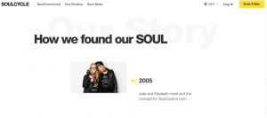
In addition to posting clear mission statements on their websites, companies can communicate their core values through examples of how they apply these values through their actions and operations. This tactic doubles up as a storytelling opportunity.
And who does not like a good story? Both company-led and, subsequently, customer-led storytelling bring more authenticity to the brand.
Brand Distinction: Authenticity Over Differentiation.
Traditional marketing stresses brand differentiation. To be different and to stand out from other brands promises to take businesses to the next level of success.
While this approach might be helpful at times, focusing on authenticity to promote brand distinction is a more sustainable practice for brand longevity. A company can try to stand out in a million ways, but it can only be itself in one way.
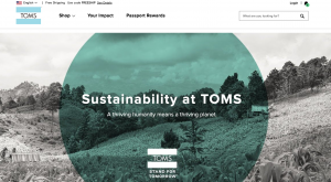
A brand can show authenticity on its website through specific, distinct, unique layouts. It can show its human side with natural, casual, relatable voice, tone, and language. And it can tell its story and define its values and a mission.
So don’t be distinctly different. Be distinctly you.
Even if your hair and eyes are falling out. Because that just means you are real.
Why is authenticity so significant for contemporary brands?
Authenticity is significant as people do not only purchase products but also the stories, values, and emotions which seem to be “real” to them. If a company is honest, cohesive, and human-like, it will be more likely to win trust, memory, and loyalty from customers. This is especially true online where consumers cannot see, touch, or smell the product yet; thus, authenticity is the only way and hence, the main way to bridge that gap. It is reflected in the way you communicate, what you believe in, and whether the experience you promise matches the one you actually provide.
What is the distinction between brand character and authenticity?
Brand character refers to being recognizable and to being different from competitors. The symbol of the barber’s pole is a good example: you understand immediately what it signifies. Authenticity implies being true to yourself and forming a real emotional connection. For instance, Cabbage Patch Kids and Play-Doh are brands with their own distinct identity, yet the very first impression when one recalls them is tied to the emotional connection. Distinction attracts attention. Authenticity is the source of love and remembrance. The most powerful brands mix both: they are easy to spot and at the same time feel very “real” to their audience.
What role does a website play in making a brand appear more “real” and authentic?
A website can cause a company to seem real by acting like a very interactive part of the whole character of the company. That is the way the design, writing, and how they react to the visitors go. If the website is consistent with the visual, easy to use, truthful in what it offers, and has a very human, friendly tone used in the writing, the visitors will think that they are dealing with real human beings and not a corporate machine without a face. Authentic websites narrate stories, exhibit the people behind the brand, and provide quick access to visitors asking questions, needing help, or wanting to be recognized.
What is the importance of the aesthetics and first impressions online?
The impressions are created by people in a matter of seconds, usually without them even noticing it. Online, that “thin-slicing” is faster still due to the very large amount of competing content. If a website is found to be cluttered, old-fashioned, slow, or hard to navigate, the users will very likely consider the company behind it to be untrustworthy or unprofessional and will thus leave. High-quality aesthetics do not mean expensive and extravagant designs but rather simplicity and visual unity. When the colors, typography, layout, and imagery are carefully coordinated, the site appears to be both credible and inviting and the users are much more likely to stay for a while and interact.
In which ways can a brand reveal its “human side” through a website?
A brand can reveal its human side by means of impersonating and portraying real people’s ways of talking and acting. It, thus, entails the use of simple, everyday language instead of stiff corporate jargons, acknowledgment of emotions, and presentation of customers’ situations with the understanding. It can be in the form of friendly microcopy, a warm thank you note after form submission, a considerate live chat reply, or a founder’s story told in a truthful, unpolished manner. The use of humor, the display of vulnerability, and even the occasional mistakes can all work towards making the brand more human and less machine-like.


