How to Create Effective Call-to-Action Buttons on Landing Pages
10 May 2019 By: Natalya Bucuy
Updated
A guide to creating effective call-to-action buttons on landing pages.
You can lead a horse to water but you can’t make him drink.
You can lead prospective customers to your landing page, but you can’t make them click on your call-to-action button. What you can do is optimize the button so the prospect is more likely to click it.
So how do you do it?
We’ve combined our own experience with research from top marketing experts on successful landing pages and call-to-action optimization.
Read on as we examine these best strategies for designs that increase your prospect to lead conversions.
Text
Your button language should be simple, to the point, and reference what the prospective customers will be getting once they click on the button.
The best strategy is to avoid generic and boring calls to action such as “sign up,” or “click here.”
Marketing expert, Fahad Muhammad of Instapage, calls such verbiage “high friction words.”
“Words like ‘Submit,’ ‘Buy,’ ‘Sign Up,’ and” ‘Download’ are high friction words when used by themselves. These words imply that the visitor has to perform chores, and who likes doing chores? Nobody I know.”

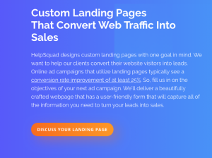
Instead, specify the benefit the customer will be getting. For example, on our own landing page at HelpSquad, we use such calls as “Get a Quote,” and “Discuss Your Landing Page.” These buttons are effective because they tell the prospective customers exactly what the customers will be doing and getting upon clicking the button.
Long sentences on call-to-action can distract the visitor. Keeping the button language short and precise is also important as such strategy keeps your prospect’s focus.
Another good strategy is to use power words – words that through extensive testing have been proven to increase lead conversion. The list of these power words can get pretty extensive. The five most persuasive ones according to Buffer Marketing Library are “you,” “free,” “instantly,” “because,” and “new.” Including those words in your button copy can help increase prospect conversion.
Landing Page Images
Using photographs on your landing page can be an effective design strategy. Images liven up pages and call help carry the message of the website and the landing page through.
As digital marketing guru Neil Patel explains in his CTA optimization video, placing an image of a human face can be an especially effective strategy if the eyes in the image are directed toward the call-to-action button.
While we’re on this note, using images on the landing page, in general, is a very effective strategy. Online advertising agency Wordstream describes in detail how to employ this practice effectively in this article.
Colors
It is important to make your call-to-action button stand out on your landing page. One great way to achieve that result is through using color.
Folks at Yahoo Small Business explain:
“Color palettes vary from website to website but the most important thing to remember is that your call to action buttons should have a healthy contrast from the background of your website. If they do, you will likely see your buttons being clicked far more, which will increase your leads and sales.”
The best colors for call-to-action buttons are red, green, orange, and yellow. The specific color you choose can depend on the type of product or service. Red sends a message of urgency. Green translates into peace and calm and is a suitable color if your products or services are related to environment, psychology, and peace. Orange and yellow have been proven to associate with happiness. When the prospects are happy they are more likely to continue on their journey to convert into leads.

The worst colors to use for your call-to-action buttons are black, white, and brown. These colors do not stand out from the background enough. They do not invoke emotions, and they do not motivate prospects to take action.
Keep contrast and color complementation in mind as well to ensure the smooth and polished look of your landing page with no colors themes.
Font
Consistency is important in digital marketing. It promotes your brand and makes your website look professional. When it comes to your landing page, it does not have to resemble the rest of your website, but it sure helps if it does for the purpose of consistency.
One way of achieving the consistency is by using the fonts you use elsewhere on the site. Besides that other attributes of the font used for the call-to-action button and the rest of the landing page play an important role.
Jeremy Smith of Marketing Land put together a comprehensive guide to font use on landing pages.
Specifically to call-to-action buttons, it’s important to keep the font’s size big enough so it stands out from the rest of the page, but not so big that it clashes with it. Using negative space to create some room around the button can improve the readability of the feature.
Placement
Call-to-action buttons have to be clearly seen on the landing page, and a ui ux design course can help learners understand why placement plays such a critical role in user behavior. Ideally, the button will be located “above the fold,” meaning toward the top of the page so the prospects don’t need to scroll down to get to it. However, sometimes you need to write some copy to explain the actions you want your prospects to take, so placing the button further down the page is necessary for it to make sense.
It is also a good idea to have multiple clearly visible call-to-action buttons on your landing page. They can lead to different actions, depending on the prospect needs.
Our landing page(about landing pages!) has three call-to-action buttons. One takes the prospects to a page to sign up for our HelpSquad free 14-day trial. The second one opens up a chat window in which the prospects can speak to an agent about their landing page needs. The third one, located on the bottom of the page, where the prospect can find it after reading all the descriptions about our landing page services, allows visitors to get a quote for a landing page development project.

Conclusion
Several factors play significant roles when it comes to call-to-action buttons – wording, size, color, font, placement, as well as the surrounding space, text, and images.
While there is no concrete fail-proof formula that guarantees an increase in conversions, optimizing the button in these areas can definitely help. The most important part is to test your optimizations and see what works best for your landing page.
What specific strategies worked for you? Let us know in the comments!


