Landing Page Psychology: 8 Ways to Make More Sales
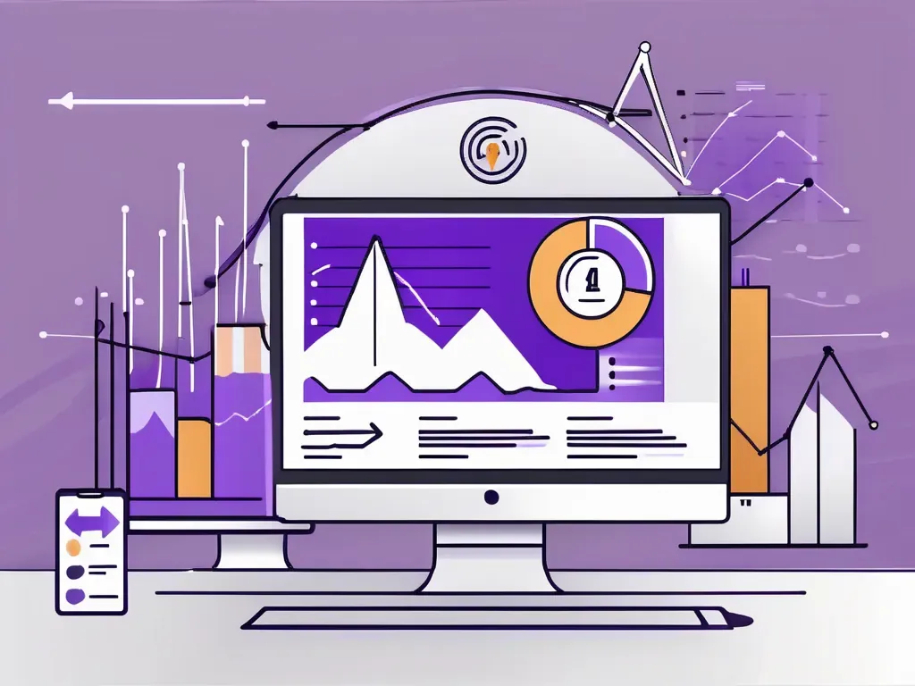
Landing page psychology covers color choices, CTA contrast, point-of-view wording, and other marketing tweaks that quietly move visitors toward a sale.

Landing page psychology is the set of design and copy choices that influence how people feel and what they do on your page, so you can increase sales. It works by reducing friction and guiding attention toward one clear action. For example, a CTA button that strongly contrasts with the page colors is easier to notice, and first-person wording like “Get my quote” can make clicks feel more natural.
I was helping my brother with an estate sale once, and he was having trouble selling what we both thought was the prized item: a perfectly good printer.
The printer had no major flaws. It was new-ish. He just didn’t need it anymore. The price was appropriate. In fact, it was a total bargain for anyone who needed a printer. He even went out to buy high-visibility stickers so the quality of the deal would be obvious. He put it on the floor in his garage, somewhere everyone would walk right by it.
Then, people would walk up his driveway, into his garage, and not buy the printer.
They would gaze at it, sure. Some people even stared at it. They clearly needed a printer.
But something was off. They would buy some 25 cent knick-knack instead.
I asked if I could make a change. There was a table in the middle of the garage where he’d set up some cheap items, like old DVDs. I thought the printer and the DVDs should swap places. Elevate the printer, get it closer to eye level, and not only would more people see it, but they would see its value.
It sold within ten minutes.
My theory? A printer on the floor didn’t look like a bargain. It may have been purchased for hundreds of dollars. But sitting there on the sad, cold garage floor lowered its perceived value. Who finds bargains on the floor, except people who go bargain hunting for a living?
As soon as the printer came closer to eye-level - in a place of prominence - the entire psychology shifted. This wasn’t a printer on the floor. This was the highlight item of the entire estate sale.
If your landing pages aren’t working too well, there might be one or two similar tweaks you haven’t made yet. And it all relies on understanding landing page psychology.
Landing Page Psychology: The Checklist
I think there are seven things every landing page needs to do, and this serves as a great checklist. Click on these below to skip to a section:
- Pick the right color for your landing page. The psychology of color is fascinating, more of an art than a science, but features some repeatable principles. Impulse/instinct purchases do better with the ROY colors, while security/service sales do better with the G BIV colors.
- Pick the right color for your CTA. The best “call to action” in existence is the stop sign because it contrasts with the environment. Your CTA needs to be obvious and contrast with the rest of the landing page without looking out of place. Use Color Palette to find the right color for your overall color scheme.
- Engage the audience’s POV. “Get my mortgage estimate” is a better CTA than “get your mortgage estimate.” Your landing page should do as much from the audience POV as possible, without sounding weird.
- Point to your call to action. Using visual elements (arrows, where a person in a photo is looking, overall page flow), point to your call to action so your audience understands what’s next.
- Write in the active voice. To make sales, clarity is essential. That starts with good copywriting “hygiene.” Don’t write “this printer will be used by you.” Write “Think of all the things you’ll print.”
- Write simply. See if you can write a headline in three words that communicates an entire world of features. Porsche, for example, once wrote an advertisement that said, simply: “Kills bugs fast.”
- Never write in big blocks of text. 77% of web browsers scan your content. Don’t write War and Peace. Write for the scanners.
- Write about benefits, not features. The iPod wasn’t “a unique sound system with a cool scroll wheel.” It was “1,000 songs in your pocket.”
There, you’re all set. Your landing pages are now perfect.
Here’s a gif of a baboon using a phone.
What’s that? You want more explanation? Let’s get to it.
Pick the Right Color for Your Landing Page
How important is color? It’s subtle enough that you, the consumer, will barely notice it. Yet it’s important enough that even a slight shift in color will have a dramatic impact on grocery sales. For example, grocery stores tested the colors of their bananas and found that Pantone color 12-0752 (Buttercup) sells better than Pantone color 13-0858 (Vibrant Yellow).
Of course, we all know bananas should be yellow. What color should your landing page be?
It all goes back to fifth-grade science, when you learned about “ROY G BIV.” This is also known as the visible light spectrum. From left to right, you have low-energy colors moving up in energy to high-energy colors.
Psychologically, ROY G BIV works in reverse. The low-energy colors (red, yellow, orange) are great for impulse and instinctual drives. The classic STOP sign is a high-energy command psychologically, even if red is physically a lower-energy light.
The high-energy colors (green, blue, indigo) will tend to associate with more rational parts of our brain, making them good for financial brands, SaaS, and more. They also communicate calm and peacefulness - even though ultraviolet light burns us. Figure that one out.
Do a Google search for “fast food color” and you’ll encounter a familiar palette that’s almost universal in these brands: energies low on the energy spectrum of ROY G. BIV. Reds, oranges, and yellows dominate:
On the opposite end of the spectrum, take TransferWise, a money transfer service:
They’ve appropriately chosen a color palette that communicates feelings of trust, relaxation, and security.
But if you want to sell a hot meal, you’re going to have to appeal to the colors more about baser instincts and appetite arousal:
The most important thing here? Fitting the product/service to the color palette.
Imagine you were creating a landing page for a luxury car dealer and used the ketchup-and-mustard palette. Yikes. It wouldn’t fit at all. Even if your content and services were good, people would associate the color palette with gimmicks. The “energy” would be off.
Note that ROY G BIV isn’t a hard and fast rule, but an overarching trend. Do a search for “American Express” and you’ll note that they use more than blue:
Amex uses interesting colors to communicate wealth and luxury: currency green, gold, cobalt hues. But there’s still a pattern of using a relaxed blue palette. They even have a card that’s called, simply, “Blue.”
Which is best for your landing page?
I can’t tell you that. But what I can tell you is that you can run a quick Google image search for your niche and get an idea of what works. Here’s what I found:
- Software as a Service: Blues, light blues, greens.
- Financial services: Blues, greens, occasional contrasting red for power.
- Luxury products: Blacks, golds, whites, silvers. “Metallic” colors such as cobalt.
- Healthy food: Vivid colors of all types, but especially vibrant greens.
- Weight loss: Greens, olive greens, and lighter versions of “action” colors, such as pink instead of red.
- Landscaping: Earth tones: greens, yellows, browns.
- Construction: “Middle” colors such as greens, yellows, blues. A mix of both action and trust.
- Colleges and universities: All over the map thanks to mascots and unique brands, with a general trend towards blues.
- Real estate: Blues and greens.
- Creative: All over the map, with a general trend toward yellow.
- Electronics: Blues and greens.
These aren’t hard and fast rules. You’ll find many brands also use different shades - like gold - to evoke different associations. But if you’re making an obvious mistake with the color palette of your landing page, it shouldn’t be hard to find out with one or two Google image searches.
How to Pick the Best Color for Your CTA
In a word: contrast.
Studies showed that our ancestors evolved to identify objects that contrast with the surrounding elements. Finding berries in a bush or searching for predators in the grass can have that sort of effect.
In modern days, contrasting elements still get our attention. Nick Kolenda found that switching from a green call to action (when the rest of the site was black, green, and white) to a red call to action increased conversion rates by 21%.
Creating a contrasting call to action isn’t just about making it more visible. It’s also about making it stand out and demand attention.
But you’ve already picked a color palette. How do you pick a color that’s both appropriate and attention-grabbing?
- Click to Color Designer and choose an appropriate color palette. For example, let’s say you’re launching a real estate agency, in which case you’d choose a processing-oriented color, like blue.
- Look for the colors that pop out the most to you. In this case, you’ll notice that colors on the opposite end of the energy spectrum - like yellows and oranges - particularly stand out.
- Click “Open palette editor” to get the exact HEX codes for your new palette. Voila. No more wondering if you’re doing color psychology the right way.
Below is an example from leadPops, a mortgage funnel website.
The blue background is great for the mortgage industry. Blue is one of the top choices for financial products. Orange fits within the palette while also calling attention to itself. The only thing I’d amend: moving the arrow to point at the empty “zip code” bar. It’s always good to make your on-page elements literally point to where the user’s eyes need to go.
And speaking of that…
See Things From the Audience’s POV
Want the fastest way to create a “scummy sales” vibe? Do everything from your perspective: talk about how great you are, what it is you do, and push someone to make the sale as soon as possible.
The issue with this strategy is that it fails to put your audience in the driver’s seat. You aren’t viewing things from their perspective.
Take the popular YouTube cooking channel, Tasty. Tasty built up a massive 18.8 million subscriber following with its viral cooking videos, many of which don’t feature chefs at all.
They’re often shot from overhead with the chef’s arms coming from underneath. This is essentially what you would see if you were to try the recipe at home:
What does this have to do with your landing pages?
The more you can put yourself in their shoes, the more likely it is you’re going to create content that resonates with them. Consider the following:
- Writing CTAs from the first-person. “Get my free estimate” will almost always be a good call to action, especially compared to “Click here to find out more.” Write with clarity and consider using the first-person to add immediacy to the CTA.
- Include visual elements that put the viewer in the driver’s seat. For example, one ice cream’s landing page includes a top-down view of the ice cream placed on the counter, as though the viewer had just purchased it themselves. How does that contrast with the typical “studio” shot of the product?
Point To Your CTA
Marty McFly would probably write a great landing page. Why? Hhe understood the concept of “social gazing.”
(BACK TO THE FUTURE) | Marty VS Biff (1985)
To get Biff’s attention off of him, he looks off to the window and asks: “What’s that?”
The oldest trick in the book, sure.
Still works.
Simply put, if you want more people to click on your CTA, you should use as many cues as you can to point to it:
- Employ “social gazing” to highlight your CTA. Social gazing is a principle that says we tend to look at what other people are looking at. Call it the McFly effect. If you put a stock photo of an individual on your landing page, try to use one that looks right where the call to action is. Heatmap studies suggest that if the individual in the photo is just looking back at you, it doesn’t do as good a job as directing the audience’s eye where you want it to go.
- Use “low-end” and “high-end” options to target the sale you really want to make. If you’ve ever seen the show “Bar Rescue,” you know that $20 cocktails aren’t always there to be sold. They’re there to make the $8 cocktail seem more reasonable. This is particularly important for SaaS landing pages - always put your target package in the middle.
Want to create a better landing page?
Want to offer 24/7 live chat support on your site today?
Start a Free 14-Day Trial of HelpSquad - no credit card required.
Write in Active Voice
You may have heard of “active” and “passive” voice. But what do they mean exactly?
Passive voice is the result of awkward subject-object placement within your sentence.
- This is an active sentence. This sentence is strong and clear.
- Passive voice is used in this sentence. Clarity is somewhat obstructed.
If you’re still not sure what that means, let’s take a simple active sentence: “I love hamburgers.” Here’s what happens when you move around the subject and object:
You might have seen complaints about passive voice on Wikipedia. For example, if you read “Mozart’s concertos were well-received,” Wikipedia might include a note: “by whom?” Writing in passive voice almost always reduces clarity. It introduces too many words. Too much mystery.
A good rule of thumb in writing circles: if you can replace the last words of the sentence with “by zombies,” you’ve got passive voice.
Don’t say “our hamburgers are loved by many.” Say “people love our hamburgers.”
Write Simply
Reportedly, Napoleon once famously said that “orders must not only be easy to understand. They must be impossible to misunderstand.”
Landing pages should be the same. There should be zero friggin doubt about what you’re selling. Zero friggin doubt about the benefits.
The greatest sales copy of all time is simple:
- Just Do It.
- 1,000 songs in your pocket.
- Got milk?
- Betcha can’t eat just one.
- Eat fresh.
- Diamonds are forever.
You get the point. In Noah Lukeman’s “The First Five Pages,” he recommends removing all modifiers and adverbs from your content. They don’t enhance clarity, he argues. Most of the time, they just add verbosity.
- Good writing =/= complex writing. Landing pages are not term papers. They exist only to capture leads and forward them through your sales funnel. Disconnect from the “good writing/complex writing” myth and focus on what gets results.
- Give yourself the “three word challenge.” Can you summarize your benefits in three words? Porsche can. “Kills bugs fast” communicates an entire lifestyle of speed, fun, and even a little danger.
- Run your entire landing page copy through Hemingway App and aim for Grade 4 or lower. The lower the grade level, the better your copy. This is golf. You want to score low here. If you have any sentences rated “very hard to read,” split them up or delete them completely. See what it does to the clarity of your site.
Make Sure Your Content is “Scannable”
According to Databox, a good “average session” from your users is about 2-3 minutes. If you’re still reading this, you’re doing pretty good.
Since 77% of people scan web pages instead of reading them, breaking up your content into bite-sized chunks means you’ll be fitting the message to your audience.
Write the Benefits, Not the Features
Let’s say you’re selling a landscaping service. It’s important that your website list all of the features of your service. If you offer lawn mowing, hedge trimming, etc., list it all. But keep in mind that these are the features of your service. Not the benefits.
When Apple first sold the iPod, they thought in terms of consumer benefits first.
Features are nice, but they’re boring. “Sort your song by artist or playlist” does not make a compelling headline. “1,000 songs in your pocket” succinctly sums up the benefits to the consumer.
Let’s take our landscaping service example again. What’s the benefit to the consumer? This is when you have to get into their head. Imagine the smell of freshly cut grass as you get home from work - and you don’t have to lift a finger.
This is a technique known as “thinking past the sale.” The goal here is to get someone to imagine the benefit to their life once your product or service is in it.
You can always list features later. You can even include a section dedicated to those features on your website.
But if you want to make the sale on your landing page, never forget that your primary goal is to sell the benefits.

How to Create Effective Call-to-Action Buttons on Landing Pages
A marketing guide to call-to-action buttons that actually get clicks, covering button text, power words, image placement, and color contrast on landing pages.

83 Tools and Resources for Personalizing and Optimizing Your Emails, Lead Generation, and Marketing
Everyone knows how to sell online. You stick to a simple acronym: AIDA. Then you set up a website and you have no idea what to do next. Luckily, there are plenty of tools and resources for personalizing your approach if you’ve ever found yourself in this exact spot. Sure, whippin
Improving Your Conversion Rates with Landing Page Video
Low conversions on your landing page often come down to one missing piece. This marketing guide covers video types, placement, and what actually moves visitors.
Let's talk about what your practice actually needs.
A 30-minute call. No sales pressure. We'll tell you honestly whether we're a fit.