Website Differentiators: Convert Over the Competition
10 Apr 2019 By: Jessica Wise
Updated
How many people were in your H.S. graduating class? This might be a strange way to start an article on website differentiators, but humor me for a second. Stop and think back. Whom do you remember most vividly? I bet it’s not the guy that would be classified as Mr. Just-Another-Face-in-the-Crowd. The dude who had so-so grades, ran an average time in the 400-meter dash and drove a Chevy Cavalier. He’s just a vague memory now.

Who you actually remember is the Punk Rock hero that raged at underage parties with his garage band. You know…the type that drove around in a concert-sticker-covered 1985 Ford Conversion Van. Or, what about the Mathlete that sported a wheelie backpack, new balance sneakers, and striped polos? He was the kid that was never late to class and always raised his hand to ask questions that made the entire class grown in unison.
The people you remember were unique, identifiable characters that stood out among the hallway masses. At just a quick glance, you knew what they were all about. And those eccentric, unforgettable personalities…those people would make great websites.
But, What Do Website Differentiators Have To Do With High School?

Hopefully, my little narrative was able to set the stage for you on why it’s so important for your website to be different. Right now there are over 6 billion active websites on the internet. There’s an ever-growing population of domain real estate. As you can imagine, it’s easy to get lost in the hustle and bustle. And, if your competitors happen to have kickass websites, it can be even harder to stand out. In the internet jungle, the only way you’re going to survive is if you have some solid website differentiators that will help you convert over the competition.
So, here’s how you can turn the tide of the web’s traffic to your virtual door.
Your Website Should Be A Reflection of Your Brand
Your brand defines you. It makes you unique. Your website should do the same thing. The look, the feel, the font, the images…everything about your website should be instantly recognizable as yours.
Colors
According to digital marketing expert and mercury.ONE CEO, Joshua Goldfein, “Too many colors on a website can be overwhelming. Therefore, a good website should have no more than three colors and their slight variations.” So, choose wisely. Ask yourself…what type of emotional impact do you want your theme to have on visitors? What kind of personality does your brand want to convey? Oh, and don’t forget to choose a color scheme that fits in with your product packaging and logo.
Style
It’s important to maintain a consistent style across the entirety of your website. But, your style will be comprised of more than just colors and images. It’s also established by the layout, text formatting, and even by the font you pick. Every element should come together to create a cohesive, engaging visual experience.
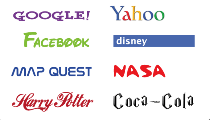
For example, your chosen font is a major factor in determining your brand’s identity. Here’s proof:

It actually feels uncomfortable to look at the names of these famous brands adorned in the incorrect fonts, right? That’s because a brand is often immediately recognizable by its font. In the same respect, so is a website.
A page’s textual formatting is also crucial. Use consistent headings and maintain equal spacing between blocks of text. In addition, consider identifying meaningful words with bold-ing and/or italics. Make the text and the font wholly yours. The key is to make sure you carry the same look throughout your domain.
Above all, you should strategically plan your layout. If you want to build a website that will set you apart from the competition, you have to place the most important visuals in hot-zones (a.k.a. areas of your site that get the most attention). That would mean positioning your logo, tagline and any brief (but pertinent) content at the top left-hand corner of the page. According to the Gutenberg Diagram, this is the area that will grab a user’s attention first. As for the rest of the page, try to keep in mind that people scan webpages in an F-pattern. Their eyes typically make two horizontal passes followed by a vertical pass. Arrange your most thought-provoking images, graphics, and written content accordingly. You can even use ready-made templates to structure your layout and arrange your most thought-provoking images, graphics, and written content accordingly.
Make Your Mission Clear
Your mission statement is arguably the biggest differentiator you will ever have at your disposal. In the simplest terms, every visitor that comes to your website wants to know what you can do for them. Take that fact, and turn it into an opportunity.

Make sure the few words you choose to spotlight will speak to your audience’s pain points. According to recent studies, a website’s first impression really matters. Users only spend an average of 5.59 seconds looking at a page’s written content. So, shorten up your mission statement (or “About Us”), and put that info front and center.
Lastly, say what you have to say accurately and creatively. “If your initial messaging and navigation are convoluted, bounces may continue at a high rate. Hit them with a one-sentence, concise statement,” says Forbes contributor and Buffalo.Agency Vice President, Glenn Gray. So, say what you have to say fast and loud. Then, dress it up with bold text and eye-catching color or include an engaging hero image as a backdrop. More than anything else, make sure visitors walk away from the experience knowing exactly who you are and what you do.
Have A Killer SEO Strategy
Unless you optimize your website to appear near the top of the search engine rankings, there’s a good chance that your staff and your pre-existing customers will be the only people to ever see your website. SEO is how you get found. whether you’re handling it in-house or leveraging the expertise of an SEO reseller. That’s why it’s considered a major website differentiator. Your pages’ keywords, load speed, and quality links will all contribute to determining how much of an impact your SEO will have.

Keywords
Every page of your website should be built around a specific keyword. Developing an effective keyword strategy is one of the best ways to ensure that you will be discovered by internet surfers. It’s also important to write headers, meta tags, meta descriptions, and image alt-text that will properly support your keyword and topic of choice. Ask yourself: Does each of your webpages have a focus? And, are you employing phrasing that people would use to search for your product or service?
Load Speed
The very first experience a visitor has with your website will be with its load speed. Remember, your page has to fully load before someone even has a chance to view it as it’s meant to be seen. If your design takes even a second too long to fully populate, you could experience up to a 7% reduction in conversions. A faster, rival website is just one click away. Every second counts.
Not only does a site’s speed impact the user’s experience, but it’s also has a major influence on its SEO ranking. Long load times negatively affect SEO crawling. To optimize your website, make sure your images are sized correctly and consolidate your code where possible. Here’s a great article titled ”6 Ways to Fix Your Slow-Loading Site” from HostGator’s Kevin Wood that explains how to do both.
Link Building with Quality Content
Backlinks and internal links are two types of links that will play a significant role in making your website stand out. Why? Because, they are what will pass value to and through your website.
- Backlink building is the process of getting reputable, outside websites to link back to your website. Quality outside sources that point back to your domain signal to Google that your content is useful and trustworthy.
- Internal link building is the practice of linking to high-value pages within your own website. Internal links help to spread link equity throughout your domain.
Establishing these links is one of the most important SEO ranking factors. Thus, if you excel at developing a solid linking strategy, there is no doubt that you are going to get noticed. The key is to focus on obtaining and creating natural-feeling links.
It bears mentioning that Google’s algorithms reward sites for building reputable and appropriate links and penalize pages that have spammy, low-quality links. So, avoid purchasing endorsements, commissioning irrelevant directory submissions, or “link trading“ with unrelated websites. Yes, organic link building can be an arduous process and high-quality backlinks are challenging to earn. Fortunately, there are steps you can take to facilitate the process.

Below are a few internal link and backlink building strategies to get you started.
Internal Link Building Strategies:
- Naturally Flowing Anchor Text – Anchor text is the clickable text that readers see as they browse through your content. Do not focus on stuffing your anchor text with keywords (though using keywords isn’t a bad thing if you do it appropriately and in moderation). Instead, use natural phrasing and words that are relevant to the content you are linking to.
- Deep Linking – It may sound strange, but try to avoid internally linking to your homepage or contact us page. The navigation menu already contains links that connect to those pages. The links that will generate the best results will lie deep within the structure of your website or blog.
- Follow Links – Nofollow tags will keep Google from crawling your internal links. Make sure your internal links are dofollow links. According to SEO guru, Neil Patel, dofollow links are one of the best ways to strengthen the structure of your website. “The link value needs to flow freely to and from internal pages, rather than get stopped up by a nofollow. Keep things free and fluid,” says Patel in his blog post titled ”The Seven Commandments of Internal Linking that Will Improve Content Marketing SEO.”
External Backlink Building Strategies:
- Create Good Content – Create engaging, shareable content that will be of value to your audience, your influencers, and your influencers’ readers. Publish interesting items like infographics, skyscraper content, ultimate guides, and helpful lists that people will instinctively want to reuse and reference.
- Guest Blogging – Provide free content to a reputable website in exchange for a link back to your domain. This scenario is a win-win because the website you choose to partner with will get free content, and your domain will benefit from the “link juice” that their backlink generates.
- Commenting – Do a search for lists of DoFollow blog commenting websites. Then, make relevant comments on high-ranking DoFollow blogs. The DoFollow backlinks provided by your comments will push equity back to your website.
- Broken Link Building – Identify broken backlinks (or 404s) on competitor and industry websites using a free broken link tool (i.e. dead link checker). Once you find dead links, alert the site’s webmaster and suggest appropriate links from your domain to replace them. Consider leveraging outsource link building services if your team lacks the time or expertise to handle these processes in-house. Partnering with specialists can help scale outreach campaigns while maintaining quality and relevance.
- Network and Establish Relationships – Link building is in fact relationship building. So, build relationships with influencers and take advantage of existing relationships with clients and providers. Start by throwing potential candidates some kudos. For example, mention a targeted influencer on social media or cite them in your blog. Then, reach out and ask to start a linking partnership.
Make Your Page Interactive
You have mere seconds to grab your website visitors’ attention. And, if you can’t appeal to their interests quickly, then they will bounce right on their merry way. Thankfully, engaging content is here to save the day. In recent years, it has become one of the easiest ways to hold the eye of viewers, and it has also become one of the most effective website differentiators you can invest in. According to the content marketing solutions software company, ion interactive, 88% of marketers believe that interactive content is effective in helping their brand stand out from competitors.
Interactive elements are features that entice users to take action (i.e. moving images, animations, landing page videos, games, forms, social media shares, etc.). According to the website optimization experts at CrazyEgg, “Interactive elements turn passive users into active participants.” It’s content that motivates visitors without making them feel bombarded or “pushed.” Instead, these elements turn a browser’s experience with a website into an enjoyable and intriguing adventure.
Below is an example of a branded website that has hit the engagement nail on the head. In fact, UK web design firm, Green Chameleon’s, temporary holding page has been named one of the top Web/Interactive Websites by Awwwards because of how addictively interactive it is.
So, take a play out of Green Chameleon’s handbook and strategically place moving elements on “the fold” if you want to encourage users to keep scrolling OR implement mouse triggered hover effects to nudge visitors towards clickable buttons. The human eye is naturally drawn to movement. Therefore, no matter how you choose to incorporate interactive elements, you’ll notice higher conversion rates once you do.
Differentiate or Bust
Whether you decide to have a reputable web design and development team revamp your website or you choose to handle the project in-house, make sure that these areas remain major points of focus. If you place an emphasis on fine-tuning your domain’s key differentiators (a.k.a. branding, mission, SEO, and interactivity), your website traffic will increase and so will your company’s sales.
For more business tips and customer service advice like HelpSquad on Facebook or follow our business page on LinkedIn.
FAQ’s
What makes a good web page design, according to this article?
A good page design is one that clearly differentiates you: it reflects your brand identity, communicates your mission fast, supports a strong SEO strategy, and uses interactive elements to keep visitors engaged and converting.
What makes a website visually appealing (beyond “nice graphics”)?
The post emphasizes consistency: cohesive colors, font choices, layout, and formatting that feel instantly “yours.” It also recommends a clean structure (consistent headings, spacing, and emphasis like bold/italics) to create a unified visual experience.
What is good web design when it comes to branding and first impressions?
The article argues your site should be a direct reflection of your brand, so visitors can recognize who you are quickly. It also notes that first impressions happen fast and encourages making the key message and visuals obvious immediately.
How many colors should a website use to look professional and not overwhelming?
It quotes a recommendation to use no more than three colors (plus slight variations) so your design stays focused and readable rather than visually chaotic.
How should you structure a page so people actually see the important parts?
The post highlights putting key elements (like your logo/tagline and brief, relevant copy) where attention naturally goes early, and designing for how people scan, referencing concepts like “hot zones,” the Gutenberg Diagram, and the F-pattern.
What “unique website features” does the article suggest to stand out?
It recommends making your page more interactive with elements like animations, moving visuals, videos, forms, hover effects, and other engaging features, because these turn passive visitors into active participants and can reduce quick bounces.
How does SEO create a website competitive advantage?
The article frames SEO as a key differentiator: using focused keywords per page, improving load speed, and earning quality internal links and backlinks so your site is easier to discover and more trusted by search engines.
Where does HelpSquad get the information for this article (and how credible is it)?
The post is by Jessica Wise (dated April 10, 2019, updated October 30, 2025) and supports its advice by referencing established UX/SEO concepts and linking to outside sources for specific claims (for example, scan-pattern ideas and conversion/speed stats). It’s best read as a practical, sourced marketing guide rather than formal research.


